
Designing a narrow border can transform any visual element into a captivating masterpiece. By carefully selecting colors and patterns, I can create stunning contrasts that draw attention and enhance visual interest.
The Impact of Borders on Design
As I dive into the world of design, I find that borders play a crucial role in framing and defining elements within a composition. A narrow border, though often overlooked, can significantly influence the overall impact of an artwork or design. It serves not just as a boundary but as an integral part of the visual narrative. When I think about borders, I envision them as the final brushstrokes that can either enhance or diminish the entire piece.
Defining the Purpose of Borders
Before I start designing, I often ask myself: what purpose will this border serve? Will it create separation, guide the viewer’s eye, or add depth? Understanding the purpose helps me choose the right colors and materials. For instance, a narrow border can create an illusion of space, making the central element appear larger or more significant. This technique is particularly useful when working with photographs or illustrations, where I want to draw the viewer’s attention directly to the focal point.
Choosing Colors Wisely
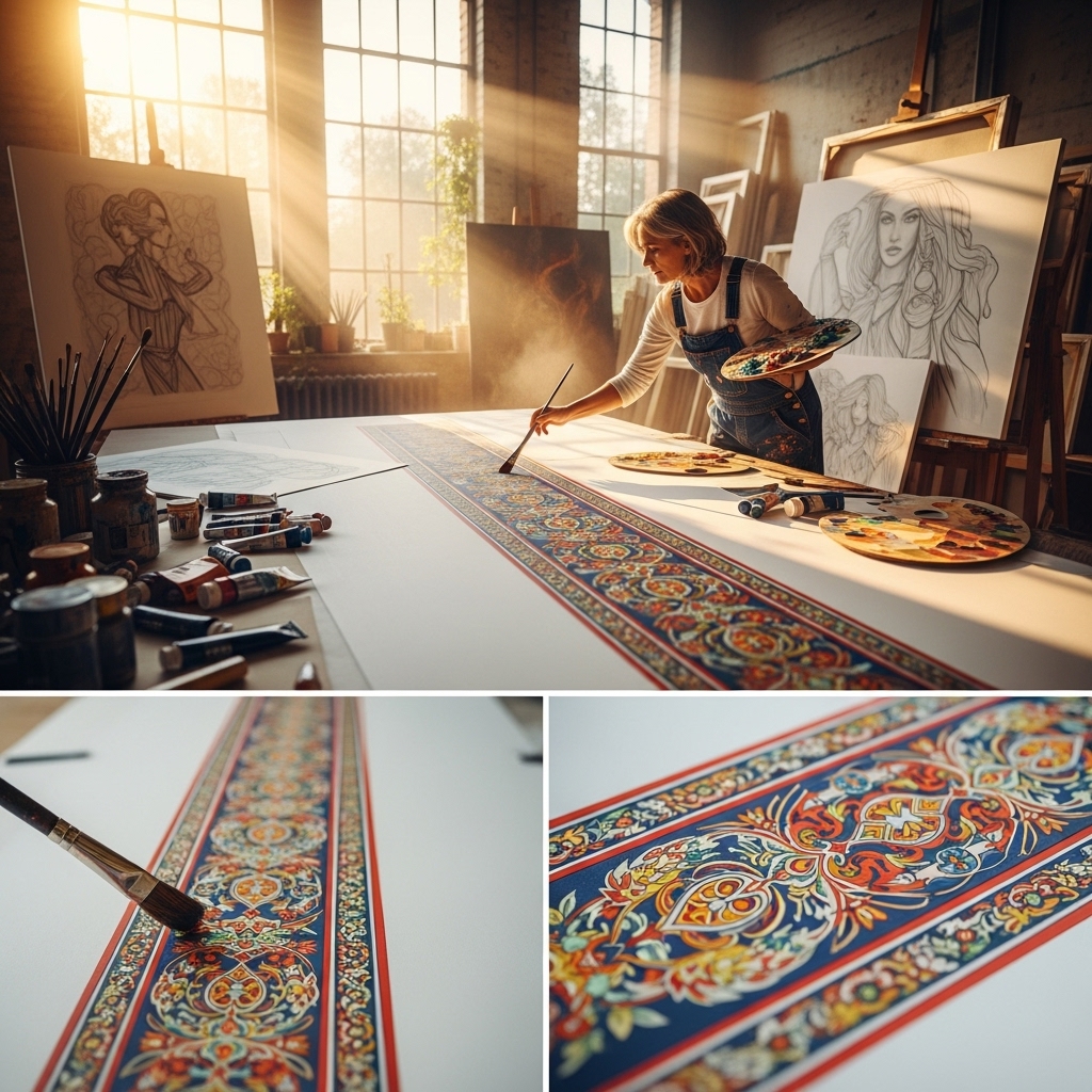
Color selection is a pivotal aspect of designing a narrow border. I often experiment with contrasting colors to create a striking visual effect. For example, pairing a bright color against a muted background can make the border pop, enhancing its presence. I’ve discovered that using complementary colors can add vibrancy and energy to the design, making it more appealing. Also, I consider the context of the design; for instance, warm colors can evoke feelings of excitement and passion, while cool colors offer a sense of tranquility and calmness.
When I’m working on a project that requires a more subtle approach, I might opt for analogous colors. These colors sit next to each other on the color wheel and can create a harmonious look. The slight variation in shades can still provide visual interest without overwhelming the primary elements. In doing so, I achieve a balance that keeps the design cohesive and engaging.
Textures and Patterns in Borders
Another layer of depth I love to explore is texture. A narrow border doesn’t have to be a solid color; incorporating textures and patterns can add an extra dimension. I often play with materials like wood grain, brushed metal, or fabric textures to give the border a tactile quality that invites the viewer to take a closer look. Textures can also enhance the theme of the design. For example, if I’m designing for a rustic brand, a rough-hewn texture can communicate authenticity and warmth.
Additionally, patterns can bring a sense of playfulness or sophistication, depending on the context. I’ve found that geometric patterns can lend a modern aesthetic, whereas floral designs might evoke a more traditional or organic feel. It’s all about matching the border with the overall theme and message of the design.
Balancing Width and Visual Impact
When designing a narrow border, I’m always mindful of its width relative to the overall composition. A border that is too narrow may get lost in the larger design, while one that is too wide might overpower the focal elements. I aim for a balance that allows the border to enhance rather than distract. One technique I often use is to adjust the thickness of the border based on the size of the central element. For instance, if I’m working with a large image, a slightly wider border can help it stand out without overwhelming the composition.
Creating Hierarchy with Borders
Designing with hierarchy in mind is vital. I use borders not just for aesthetics but also to establish a visual flow. By varying the thickness and style of borders throughout a design, I create a path for the viewer’s eye to follow. For instance, I might employ a bold, decorative border for the main visual element, while using a more subdued style for secondary elements. This layered approach helps convey the importance of each component and guides the viewer through the design seamlessly.
Experimenting with Border Styles
As I push the boundaries of my creativity, I often experiment with different border styles. From dashed lines to intricate motifs, each style offers a unique interpretation of the design. I’ve found that hand-drawn borders can add a personal touch, making the piece feel more intimate and relatable. On the other hand, clean, sharp lines can convey professionalism and modernity.
In my journey as a designer, I’ve learned that the possibilities are endless. Each project is an opportunity to experiment with new ideas and techniques. Whether I’m designing for print or digital, I never underestimate the power of a well-executed border. By focusing on color, texture, and style, I can create narrow borders that not only frame a composition but elevate its visual impact, turning a simple design into a captivating work of art.
Incorporating Borders in Various Media

As I explore the versatility of narrow borders, I realize that their application extends across different media. Each medium presents unique challenges and opportunities for integrating borders effectively. Whether I’m working with digital graphics, print designs, or even physical installations, the principles remain consistent, yet they adapt beautifully to the context.
Digital Design and Borders
In the realm of digital design, borders can transform the user experience. When I create websites or digital advertisemínkats, I pay special attention to how borders guide users through the interface. For instance, a narrow border around buttons or call-to-action areas can draw immediate attention, encouraging interaction. I find that using contrasting colors for these borders helps them stand out against the background, making them irresistible to click.
Moreover, I love to experiment with hover effects. A border that changes color or thickness when a user hovers over a specific element adds a layer of interactivity, making the design feel alive. This dynamic approach not only enhances the aesthetic but also reinforces the functional aspect of the design.
Print Design and the Power of Borders
When it comes to print design, I’ve found that narrow borders can elegantly frame everything from business cards to brochures. The tactile nature of print allows me to incorporate elements like foiling or embossing, which can elevate a simple border into something truly eye-catching. For example, a metallic foil border on a wedding invitation can add an air of sophistication and luxury, making it a cherished keepsake.
In magazine layouts, I sometimes use narrow borders to separate articles or sections while maintaining a cohesive design. This not only helps in organizing content but also creates a visual rhythm throughout the publication. I enjoy utilizing borders to create a sense of flow, guiding readers from one story to the next while ensuring each piece stands out in its own right.
Fine Art and Borders
As an artist, I also explore borders through my paintings and mixed media pieces. Here, borders take on a more expressive role. When I frame my artwork, I often opt for narrow frames that enhance the piece without overshadowing it. The choice of frame can dramatically influence how the artwork is perceived; a sleek black frame can evoke modernity, while a distressed wooden frame can lend a rustic charm.
In my mixed media work, I sometimes create borders using found objects or unconventional materials. For instance, I might incorporate natural elements like twigs or leaves into the border, enhancing the organic feel of the piece. This approach not only adds texture but also invites viewers to engage with the artwork on a deeper level, as they consider the materials and their meanings.
Borders in Photography
Photography is another area where I adore using borders. A narrow border can serve as a subtle frame for a photograph, allowing the image itself to take center stage while still providing a polished finish. When printing photos, I often select a border that complements the colors within the image. For example, a white border can create a clean, classic look, whereas a colored border might echo a hue found in the photo, tying the whole composition together.
I’ve also experimented with digital borders for online photo galleries. A consistent border style across a series of images can create a cohesive theme, making the overall collection feel more curated. This consistency is crucial when showcasing my work in a portfolio, as it helps to reinforce my artistic identity.
The Emotional Connection of Borders
As I ponder the significance of borders, I realize they can evoke emotions and memories. A simple border can remind viewers of a specific era or style, tapping into nostalgia. For instance, vintage-style borders can transport viewers back in time, evoking the warmth of past photographs or the charm of retro design.
When I design for brands, I often consider how borders can reinforce emotional connections with the audience. A playful, whimsical border might resonate with a child-friendly brand, while a sleek, modern border may appeal to a tech-savvy demographic. I love the challenge of aligning the border style with the brand’s personality, creating a seamless experience that resonates with the intended audience.
Adapting Borders for Diverse Cultures
In my travels and experiences, I’ve come to appreciate how borders are perceived differently across cultures. While a bold and vibrant border may signify excitement in one culture, it might represent restraint in another. This awareness is crucial when designing for a global audience. I strive to adapt my border designs to honor cultural nuances, ensuring that my work is inclusive and respectful.
Ultimately, borders are more than just decorative elements; they are powerful tools that enhance communication and storytelling in design. As I continue to explore the endless possibilities of narrow borders, I remain inspired by their ability to transform and elevate my creative work, no matter the medium.
Final Thoughts
The journey of exploring narrow borders has revealed their profound impact on design. From digital to print and fine art, the versatility and creativity they inspire are boundless. Through thoughtful color choices, textures, and styles, I can craft borders that not only frame but also enhance the narrative of my work. As I move forward, I look forward to pushing the boundaries even further, continually discovering new ways to incorporate narrow borders into my designs.